AKA: the Installer Anti-Pattern
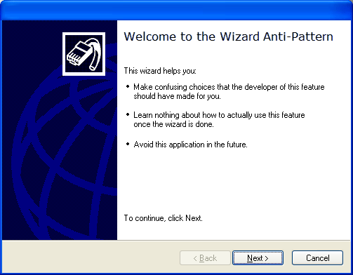
There’s a common user experience anti-pattern that pops up all over the place:
Or put another way: “Interactive configuration during setup is bad.”
The ‘wizards’ in Windows really epitomized this, and hence the anti-pattern is named after them. But it’s common elsewhere too, particularly in installers.

Why? There are two negative consequences of interactive configuration during setup:
- The worst time for a user to make choices about a system, application or feature is before they’ve started using it.
- Once the install, setup or creation process completes, the user has no idea how to change the choices they made.
The first consequence is pretty obvious. Asking the user questions they cannot answer (or cannot yet answer) is unfortunately pretty common in software today. It needs to stop.
Fix the application, software or operating system so that it does the right thing, or an acceptable default. Then let the user adjust it later if necessary. But don’t lazily punt responsibility to the user by asking them to make decisions up front.
The second consequence requires a little more discussion. When the user configures something during a wizard or setup process, they learn (whether consciously or subconsciously) how to perform that configuration task. This is useless disposable throw-away knowledge. We then force the user to relearn how to do it differently when they want to change that configuration choice. You can almost hear the internal dialog:
- “Wait … maybe I should have chosen a different time zone … this is a server after all.”
- “Hmmm, how do I change that? I just clicked that map thingy a moment ago.”
- “I wonder if I should just reinstall so and make a different choice this time?”
Now obviously there are immutable aspects of the setup process. And those unfortunately require the user to make choices. But when something really is immutable it cleanly avoids the second problem above: the user cannot change it. This mitigates the anti-pattern somewhat.
Examples
It’s easy to complain about Windows. Wizard style dialogs ask you a bunch of questions and then create something or perform some job. These wizards are pretty much the worst example of this anti-pattern … and Windows has a lot of them.
But Windows does get this right in other places. The Windows installer asks minimal questions. Here are all the choices asked during the Windows 2008 Server install: 1) The language, 2) What to install, 4) Where to install it. In my opinion the choice on screen 3) is a kludge related to Windows upgrade brokenness. But in spite of that the installer manages to largely avoid this anti-pattern. Note the lack of a prompt for creating user accounts … that happens later.

Another trivial good example of avoiding this anti-pattern is the Create new directory workflow you’ll find in most file browsers.

Instead of popping up a dialog asking for the initial directory name, the directory is created and you’re then ready to type the name. This has been implemented in various ways, but the core design concept is that the user learns one workflow for naming a directory, whether it’s a new directory or one that’s renamed.
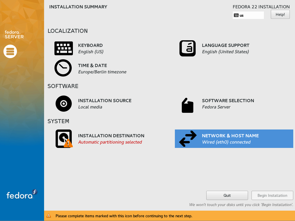
A bad example? Sadly most Linux installers end up as pretty bad examples. Operating system installers are tricky … mostly because hardware and file-systems suck. So we end up asking the user to make choices before they’ve started to use the system: bad. But as noted above, this is less of a problem for immutable things, such as where to install the operating system’s files.

But it goes down hill from there. Most interactive Linux installers go wild and present the user with all sorts of choices, and run headlong into this anti-pattern.
Almost all of these configuration choices should happen post install, with a repeatable user experience.
Solution
So what does it take to fix this? It’s not always easy. Design and UX are not just polish on the surface. Getting the UX right often affects software deeply.
Lets start with these concepts:
- Certain aspects of a system/application/feature are effectively immutable. Lets call these immutable constants.
- Other aspects of a system/application/feature are changeable. Lets call these configuration options.
Which leads us to:
-
Most immutable constants should be internalized and not exposed to the user.
For example, never ask the user to choose between one of several dependencies that the software needs in order to function. Make choices like this on behalf of the user.
-
Some immutable constants need to be specified by a user, and thus become interactive choices in the setup process.
A user may need to choose a location to install the software, or perhaps a domain name is an immutable property of the system.
-
Configuration options should have intelligent, usable, acceptable defaults.
The system or application should be able to function in a coherent and secure manner without requiring the user choose configuration options. Some features may be disabled until configured.
-
Choices related to configuration options should happen after the install process.
The user experience for configuring the application or system should be discoverable, usable and repeatable. It should be obvious to the user where to go to change a configuration option post install. Hint.
The corollary here is to make the system or application have a minimal amount of immutable constants that need to be specified by the user and therefore:
Summary
Feel guilty when you create a guided setup wizard, or add a interactive choice to installer. That’s a good guilt.
Try to figure out why a choice is necessary. Is it an immutable constant? Is there a sane default that should be used instead? What is the root cause of pushing this choice on the user?
It goes without saying … well okay I’ll say it … an automated batch installer can and should allow options to be set in order to bring up the system in a preconfigured way. A great example of this is Kickstart. But those are not interactive choices, therefore this anti-pattern does not apply.